Typography for Business Owners: A Simple Guide
Typography, typeface, font… what does it all mean? If you’ve ever wondered what the difference is — or why it matters for your business — you’re not alone. Most business owners ask this question at some point, and it’s exactly why typography direction is part of every branding project we deliver.
Why does typography matter for my business?
Typography isn’t just about “making things look nice.” It’s about:
Consistency → Creating a recognisable look across your website, social media, and print.
Clarity → Making your message easy to read and understand.
Emotion → Fonts influence how your audience feels when they interact with your brand.
Recognition → Over time, consistent typography builds familiarity and trust.
Typography is one of the pillars of brand identity (alongside colour palette, logos, and overall aesthetics) — and it has the power to make people remember you.
So, what is typography?
Typography is the art of arranging text so it’s readable, clear, and visually appealing. Think of it as “dressing up words” — choosing the style, size, spacing, and look of letters so your message not only gets read, but also felt.
Typeface vs. Font — what’s the difference?
Typeface = the family.
Example: Helvetica, Garamond, Futura.Font = the style within that family.
Example: Helvetica Bold, Helvetica Light, Helvetica Italic.
In other words: typeface is the surname, font is the individual family member.
What types of typefaces exist?
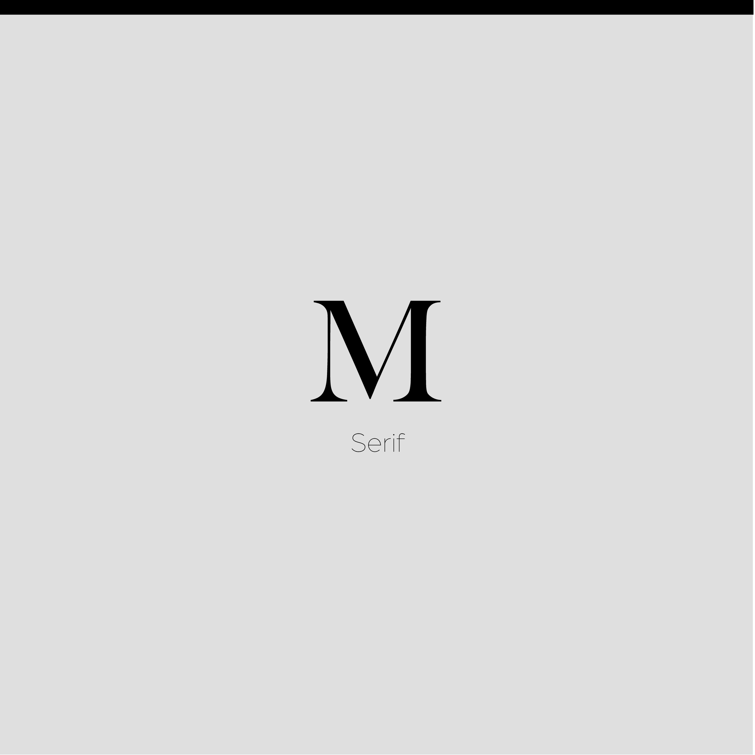
Serif → Classic, trustworthy. (Books, newspapers, luxury brands.)
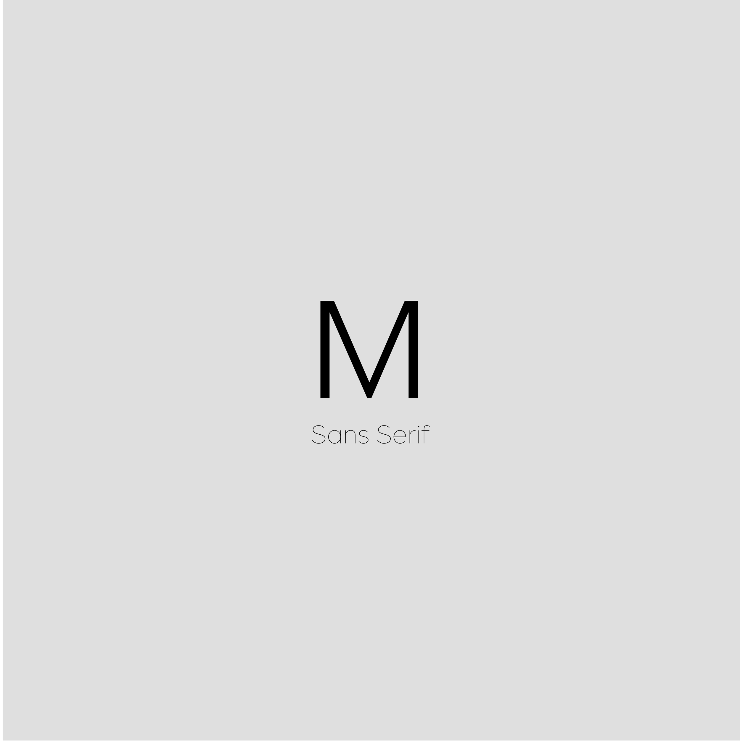
Sans-serif → Modern, minimal. (Websites, apps, startups.)
Display → Bold, eye-catching. (Headlines, campaigns.)
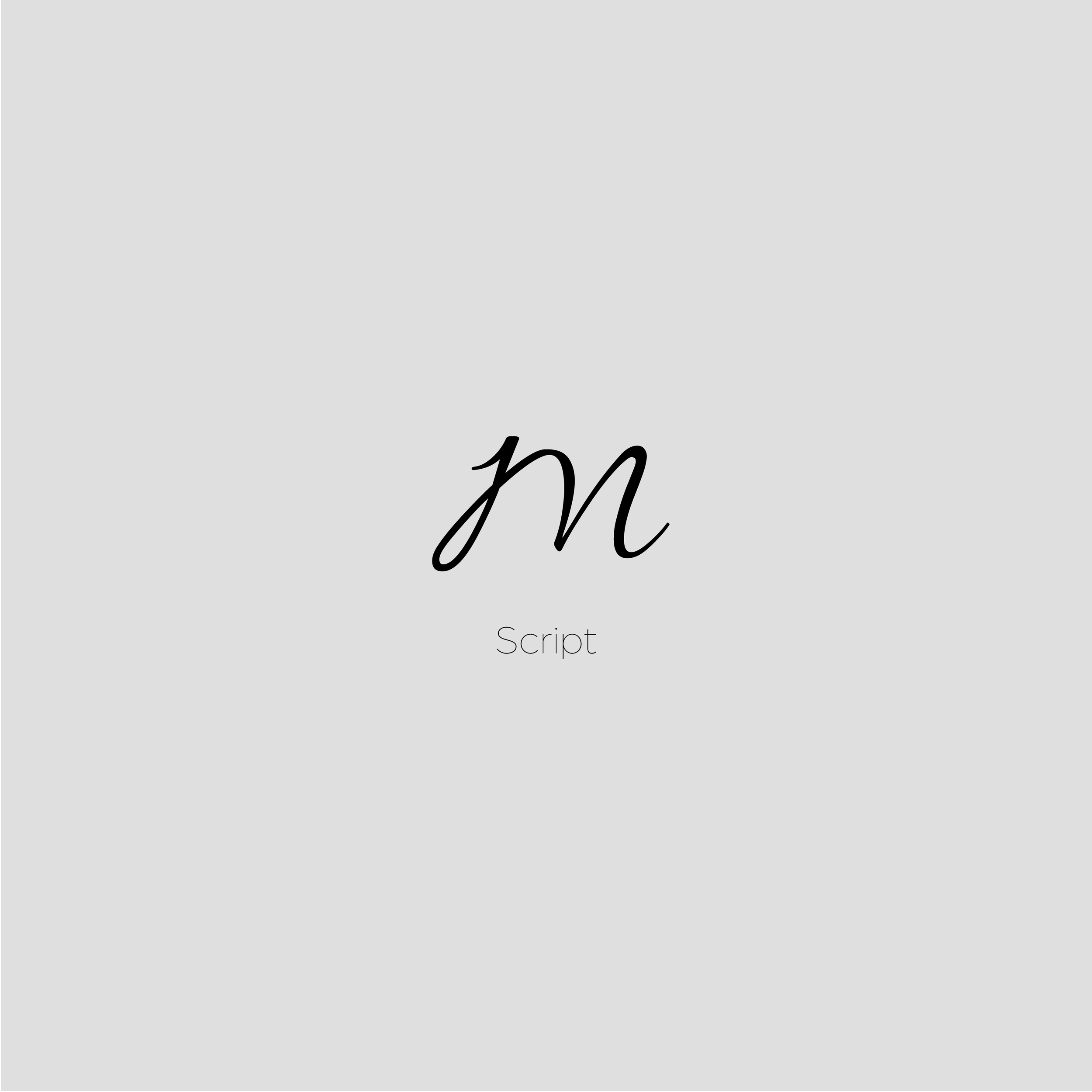
Script → Elegant, personal. (Invitations, high-end logos.)
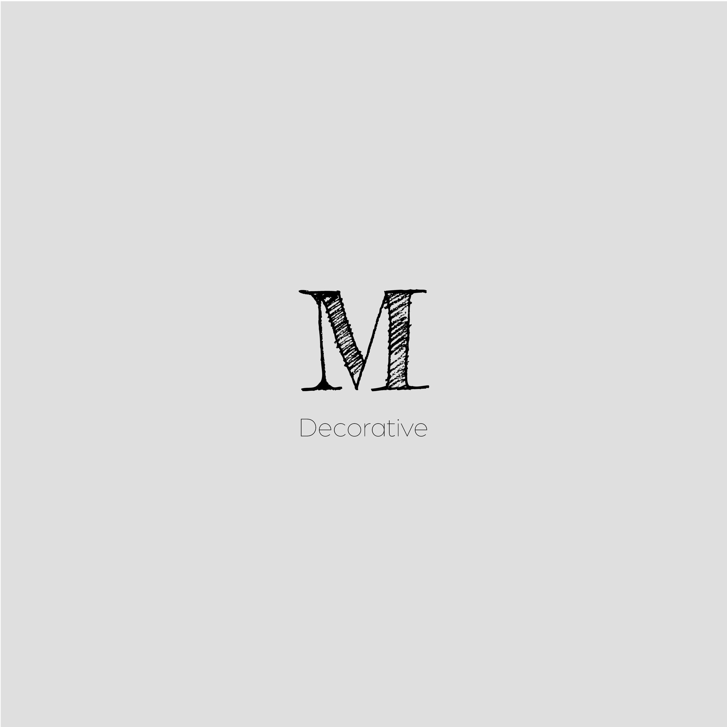
Decorative → Unique, playful. (Events, creative projects.)
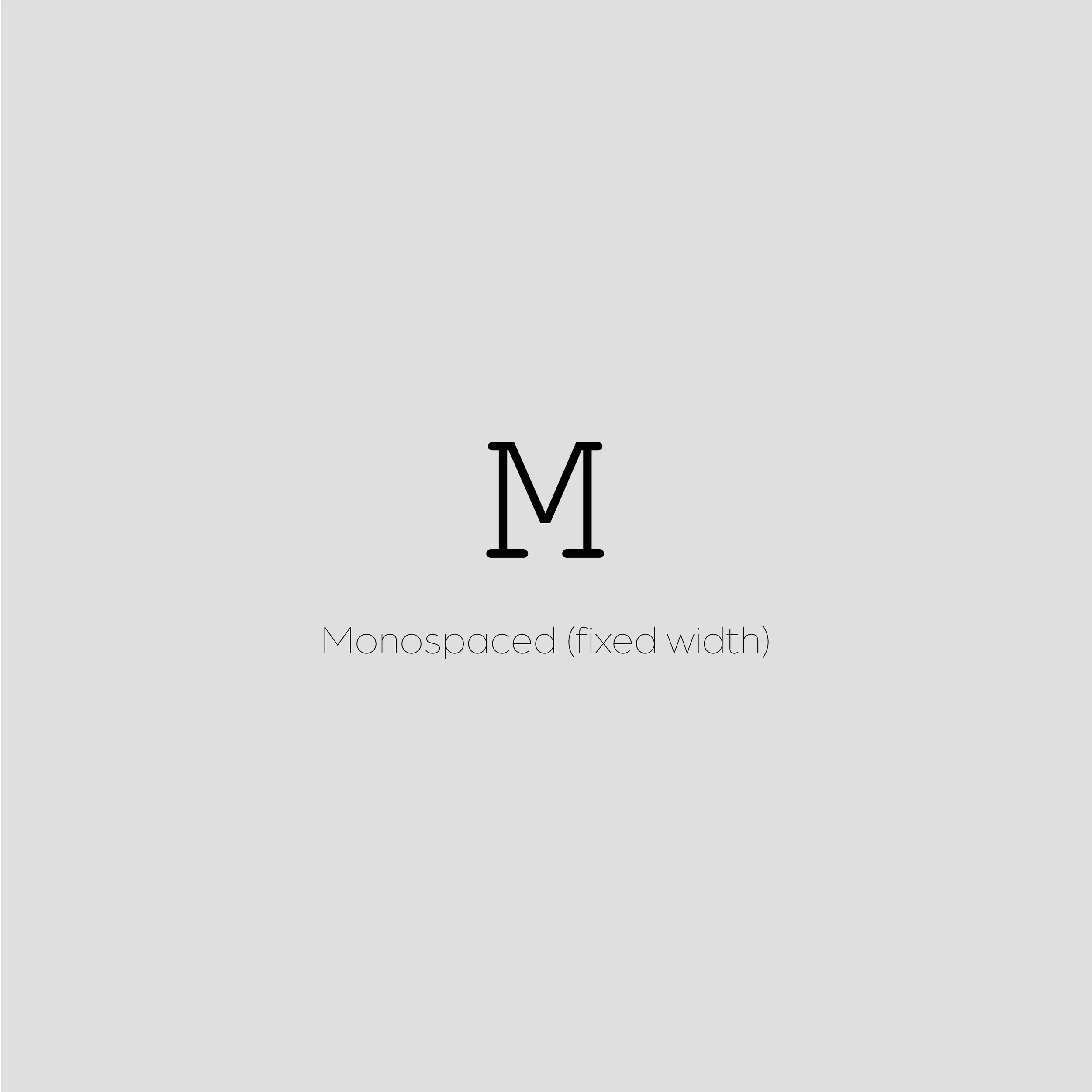
Others → Monospace (tech/code), Bitmap (retro/artistic).
Why is choosing the right typography important for branding?
Improves readability → A clean, consistent font makes your message effortless to absorb.
Sets the tone → Serif feels formal, sans-serif feels modern, script feels intimate.
Builds recognition → Consistent use builds familiarity and loyalty.
Guides attention → Fonts can direct how your audience scans a page or website.
Influences decisions → The right font sparks emotion, which shapes how people respond.
How do I choose the right typography for my brand?
Here’s a quick step-by-step:
Know your brand personality → Are you minimal and modern? Bold and edgy? Warm and approachable?
Think about your audience → What will resonate with their age, style, and preferences?
Pick a typeface family → Serif for classic, sans-serif for modern, display for bold, script for personal.
Choose font styles → Bold for headlines, regular for body text, italics for emphasis.
Test for readability → Make sure it works on desktop, mobile, and in print.
Stay consistent → Use the same typography across your website, socials, and marketing.
Last Thoughts: Why Typography is Worth Your Attention
Typography is not just a design detail. It’s a business tool. The fonts you choose shape how people perceive you, remember you, and decide to trust you.
So next time you think about your logo or colour palette, don’t forget: your typography is just as powerful.
Quick recap:
Typography = arranging text to be clear and appealing.
Typeface = the family (Helvetica).
Font = the style/weight (Helvetica Bold).
Types = Serif, Sans-serif, Display, Script, Decorative, etc.
Impact = recognition, emotion, readability, trust.
Want expert guidance on choosing typography that fits your brand? Let’s chat.

